TextView基础
TextView 基本设置
基础设置
TextView 设置字体粗细
- 布局里设置
android:textStyle="bold"
- 代码设置
//android中为textview动态设置字体为粗体
TextView textView = (TextView)findViewById(R.id.textView);
textView .setTypeface(Typeface.defaultFromStyle(Typeface.BOLD));
//设置不为加粗
textView.setTypeface(Typeface.defaultFromStyle(Typeface.NORMAL));
- strings.xml 设置
<string name="styled_text">Plain, <b>bold</b>, <i>italic</i>, <b><i>bold-italic</i></b></string>
TextView 的 drawable
TextView 的 drawable xml 属性
TextView 有一些属性可以在 Text 的四周设置一个 drawable 对象,图片,shape 等合法的 drawable 都可以用。
drawableStart API 14才有
drawableLeft
drawableTop
drawableBottom
drawableRight
drawableEnd API 14才有
drawablePadding 用以设置drawable与text之间的空间
left/top/right/bottom 就是在文字的上下左右放置 drawable。而 drawableStart 和 drawableEnd 则有特殊的意义,虽然它们是 API 14 加上去的,但是要在 API 17 后才能真正的生效,它们的作用是当语言方向发生变化时,会换边,LTR 语言 drawableStart 在左边,而 drawableEnd 在右边;但对于 RTL 语言来说就会反过来 drawableStart 在右,drawableEnd 在左
TextView 的 drawable 的一些注意事项
- TextView 的 padding 作用在 drawable 之外
- TextView 的高度或宽度为 wrap_content 时将是文字和 drawable 中较大的那一个,再加上 padding 和 margin
- gravity 只对文字起作用,对 drawable 不起作用
- drawable 会在其所在的维度居中显示,比如 drawableLeft 是上下垂直居中的,以此类推
代码设置 setCompoundDrawables 和 setCompoundDrawablesWithIntrinsicBounds
public void setCompoundDrawables(Drawable left, Drawable top, Drawable right, Drawable bottom)
// 设置Drawable显示在text的左、上、右、下位置。 要先设置setBounds(x,x,x,x);  The Drawables must already have had Drawable.setBounds called.
setCompoundDrawables和setCompoundDrawablesWithIntrinsicBounds区别
setCompoundDrawables 画的 drawable 的宽高是按 drawable.setBound() 设置的宽高,所以才有 The Drawables must already have had setBounds(Rect) called。使用之前必须使用 Drawable.setBounds 设置 Drawable 的长宽。
setCompoundDrawablesWithIntrinsicBounds 是画的 drawable 的宽高是按 drawable 固定的宽高,所以才有 The Drawables' bounds will be set to their intrinsic bounds。即通过 getIntrinsicWidth() 与 getIntrinsicHeight() 获得.
setCompoundDrawables 和 setCompoundDrawablesRelative
可以在上、下、左、右设置图标,如果不想在某个地方显示,则设置为 null。但是 Drawable 必须已经 setBounds(Rect)。意思是你要添加的资源必须已经设置过初始位置、宽和高等信息。
- 需要设置
setBounds;就是不按比例,宽高可以打破原有的大小及比例 - 要适配 RTL 用 setCompoundDrawablesRelative
和 setCompoundDrawablesWithIn 和 setCompoundDrawablesRelativeWithIntrinsicBounds
可以在上、下、左、右设置图标,如果不想在某个地方显示,则设置为 null。图标的宽高将会设置为固有宽高,既自动通过 getIntrinsicWidth 和 getIntrinsicHeight 获取。
- 不需要设置
setBounds;按照原有比例大小显示图片 - 要适配 RTL 用 setCompoundDrawablesRelativeWithIntrinsicBounds
val bitmap = BitmapDrawable(resources, it)
val width = resources.getDimensionPixelSize(R.dimen.qb_px_16)
bitmap.setBounds(0, 0, width, width)
setCompoundDrawablesRelative(null, null, bitmap, null)
setCompoundDrawables 和 setCompoundDrawablesWithIn
setCompoundDrawables 画的 drawable 的宽高是按 drawable.setBound() 设置的宽高,使用之前必须使用 Drawable.setBounds 设置 Drawable 的长宽。
setCompoundDrawablesWithIntrinsicBounds 是画的 drawable 的宽高是按 drawable 固定的宽高,所以才有 The Drawables' bounds will be set to their intrinsic bounds。即通过 getIntrinsicWidth() 与 getIntrinsicHeight() 获得。
setBounds
setBounds(x,y,width,height);
- x: 组件在容器 X 轴上的起点
- y: 组件在容器 Y 轴上的起点
- width: 组件的长度
- height: 组件的高度。
Drawable myImage = getResources().getDrawable(R.drawable.home);
myImage.setBounds(1, 1, 100, 100);
button.setCompoundDrawables(null, myImage, null, null);
局限性
有些时候它也有一些局限性而没有办法用它:
- 当 drawable 本身没有高度时(比如 shape),这个 drawable 高度就会依赖于文字,因为 padding 是加在 drawable 之外,所以只会依赖于文字的高度。有些时候这不是想要的结果。
- 当 Icon 需要与文字分开单独控制时,很显示这要分成二个 View。
- 当需要对 Icon 进行特殊的个性化时,比如添加背景,特效等。
- 其他一些造成无法使用的。
- 除上述情况外,就要考虑使用 drawable 了。
TextView 阴影效果
shadowDx/shadowDy/shadowRadius/shadowColor
XML 属性:
android:shadowColor:阴影的颜色android:shadowDx:阴影的偏移量;水平方向上的偏移量android:shadowDy:阴影的偏移量;垂直方向上的偏移量android:shadowRadius:是阴影的的半径大小;控制的主要就是阴影的宽度,它的值也大,阴影越大,而且颜色越淡
代码: setShadowLayer
setShadowLayer(radius, dx, dy, color);
// 它的四个参数,分别对应上面的四个属性
// 四个属性取值,要么直接写,要么使用getResource进行一步转化才行
代码使用:
public class MainActivity extends Activity {
    TextView tv;
    Button bt;
    int a;
    float t1;
    float t2;

    @Override
    protected void onCreate(Bundle savedInstanceState) {
        super.onCreate(savedInstanceState);
        setContentView(R.layout.activity_main);
        tv = (TextView) findViewById(R.id.tv);
        bt = (Button) findViewById(R.id.bt);
        a = 0;
        t1 = getResources().getDimension(R.dimen.activity_horizontal_margin);
        t2 = getResources().getDimension(R.dimen.activity_vertical_margin);

        bt.setOnClickListener(new View.OnClickListener() {
            @Override
            public void onClick(View arg0) {
                if (a == 1) {
                    // R.color没有效果
                    tv.setShadowLayer(t1, t1, t1, R.color.aaa);
                    a = 0;

                } else {
                    tv.setShadowLayer(t2, t2, t2, 0x800000ff);
                    a = 1;
                }
                bt.setText(a + "");
            }
        });

    }
}
各个属性值影响
- 普通效果
<TextView
	android:layout_width="match_parent"
	android:layout_height="match_parent"
	android:shadowColor="#ff0000"
	android:shadowDx="3"
	android:shadowDy="3"
	android:shadowRadius="1"
	android:text="abcdefg"
	android:textColor="#0000ff"
	android:textSize="100sp" />
android:shadowRadius="0",shadowRadius=0,就不会有阴影显示
android:shadowRadius="20",控制的主要就是阴影的宽度,它的值也大,阴影越大,而且颜色越淡

shadowDx和shadowDy
android:shadowDx="30"
android:shadowDy="30"

示例
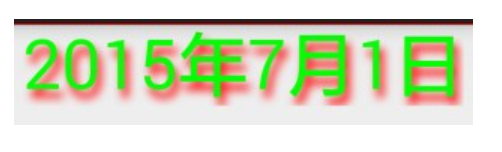
- 案例 1:
<RelativeLayout xmlns:android="http://schemas.android.com/apk/res/android"
    xmlns:tools="http://schemas.android.com/tools"
    android:layout_width="match_parent"
    android:layout_height="match_parent" >
    <TextView
        android:id="@+id/deskclock_time"
        android:layout_width="wrap_content"
        android:layout_height="wrap_content"
        android:layout_alignParentTop="true"
        android:layout_centerInParent="true"
        android:includeFontPadding="false"
        android:lineSpacingExtra="0dp"
        android:padding="0dp"
        android:shadowColor="#ff0000"
        android:shadowDx="10"
        android:shadowDy="20"
        android:shadowRadius="50"
        android:text="2015年7月1日"
        android:textColor="#00ff00"
        android:textSize="53sp" />
</RelativeLayout>
字体 TypeFace
Android 字体简介
Android 系统默认支持三种字体,分别为:sans,serif,monospace。
android.graphic.typeface 字体类:
本类的常量静态定义,首先为字体类型(typeface)名称:
- Typeface DEFAULT
- Typeface DEFAULT_BOLD
- Typeface MONOSPACE
- Typeface SANS_SERIF
- Typeface SERIF
字体风格(style)名称:
- int BOLD
- int BOLD_ITALIC
- int ITALIC
- int NORMAL
设置 TextView 的字体可以通过 TextView 中的 setTypeface 方法来指定一个 Typeface 对象,因为 Android 的字体类比较简单,我们列出所有成员方法:
staticTypeface create(Typeface family, int style)//静态方法,参数一为字体类型这里是Typeface的静态定义,如宋体,参数二风格,如粗体,斜体
staticTypeface create(String familyName, int style)//静态方法,参数一为字体名的字符串,参数二为风格同上,这里我们推荐使用上面的方法。
staticTypeface createFromAsset(AssetManager mgr, String path)//静态方法,参数一为AssetManager对象,主要用于从APK的assets文件夹中取出字体,参数二为相对于Android工程下的assets文件夹中的外挂字体文件的路径。
staticTypeface createFromFile(File path)//静态方法,从文件系统构造一个字体,这里参数可以是sdcard中的某个字体文件
staticTypeface createFromFile(String path) //静态方法,从指定路径中构造字体
staticTypeface defaultFromStyle(int style) //静态方法,返回默认的字体风格
intgetStyle() //获取当前字体风格
finalboolean isBold() //判断当前是否为粗体
finalboolean isItalic() //判断当前风格是否为斜体
textFontWeight 字体粗细
textFontWeight 生效条件
- API28 及以上
- 设置了字体
- 值在
[1, 1000]之间
XML 设置
- android:fontFamily:字体家,里面可以有多个字体,可搭配字体权重,引用的是 xml 文件,例如【android:fontFamily="@font/myfont"】,文件在【res-font 中】。
- android:textFontWeight:设置使用的字体的权重,权重高使用谁,和 android:fontFamily 一起使用
<androidx.appcompat.widget.AppCompatTextView
    android:id="@+id/tv_title0"
    android:layout_width="match_parent"
    android:layout_height="wrap_content"
    android:fontFamily="sans-serif"
    android:gravity="center"
    android:text="Free Shipping(带bold, fontWeight=900)"
    android:textColor="@color/sui_color_discount_dark"
    android:textFontWeight="900"
    android:textSize="@dimen/sui_text_size_12"
    android:textStyle="bold" />
Xml 设置不生效,用代码设置:
private fun TextView?.setTextFontWeight(fontWeight: Int) {
    if (this == null) return
    val default = Typeface.DEFAULT
    val newTypeface = if (Build.VERSION.SDK_INT >= Build.VERSION_CODES.P) {
        Typeface.create(default, fontWeight, false)
    } else {
        if (fontWeight >= 700) {
            Typeface.create(default, Typeface.BOLD)
        } else {
            Typeface.DEFAULT
        }
    }
    this.typeface = newTypeface
}
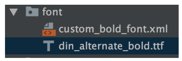
自定义字体
TextView xml 设置
- custom_bold_font.xml
<?xml version="1.0" encoding="utf-8"?>
<font-family xmlns:android="http://schemas.android.com/apk/res/android"
    xmlns:app="http://schemas.android.com/apk/res-auto">
    <font
        android:font="@font/din_alternate_bold"
        android:fontStyle="normal"
        android:fontWeight="900"
        app:font="@font/din_alternate_bold"
        app:fontStyle="normal"
        app:fontWeight="900" />
</font-family>
使用 android:fontFamily="@font/custom_bold_font"
如果这种方式不生效,检查主题是否设置了 android:fontFamily 导致不生效
<style name="Theme.AppWidgets" parent="Theme.MaterialComponents.DayNight.DarkActionBar">
    <!--<item name="fontFamily">@font/raleway_regular</item>-->
    <item name="android:fontFamily">@font/raleway_regular</item>
    <item name="android:textColorPrimary">@color/white</item>
    <item name="android:textColorSecondary">@color/white</item>
    <item name="colorControlNormal">@color/white</item>
    <item name="gradientStartColor">@color/sky_blue_200</item>
    <item name="gradientEndColor">@color/sky_blue_500</item>
</style>
TextPaint 设置
textPaint.typeface = ResourcesCompat.getFont(context, R.font.custom_bold_font)
Typeface.createFromAsset 从 assets 中加载

fun TextView.setFont(assetsPath: String) {
    val type = Typeface.createFromAsset(context.assets, assetsPath)
    setTypeface(type)
}
// 使用
binding.btnCrash.setFont("font/AVENGEANCE-HEROIC-AVENGER-2.ttf")
TextView 文字渐变
方法 1:自定义 TextView 设置 LinearGradient,渐变是整体的
继承 TextView,重写 onLayout 方法后设置 Shader
public class GradientTextView extends androidx.appcompat.widget.AppCompatTextView {
    @Override
    protected void onLayout(boolean changed, int left, int top, int right, int bottom) {
        super.onLayout(changed, left, top, right, bottom);

        if (changed) {
            int startColor = Color.RED;
            int endColor = Color.BLUE;
            getPaint().setShader(
                    new LinearGradient(0, 0, getWidth(), getHeight(),
                            startColor,
                            endColor,
                            Shader.TileMode.CLAMP));
        }
    }
}
创建 LinearGradient 时,传入的起始坐标为 (0,0),结束坐标为 (getWidth(), getHeight()),所以渐变效果是从左上角向右下角渐变的:
改成从上往下渐变的效果:
getPaint().setShader(new LinearGradient(0, 0, 0, getHeight(),
        startColor,
        endColor,
        Shader.TileMode.CLAMP));
方法 2:给 TextView 设置 LinearGradient
直接给 TextView 设置 Shader,无需自定义 TextView
Shader shader = new LinearGradient(0, 0, 0, textView.getLineHeight(), Color.RED, Color.BLUE, Shader.TileMode.REPEAT);
textView.getPaint().setShader(shader);
textView.setText("哈喽,benio\n哈喽,benio\n哈喽,benio");
多行渐变,效果不错。但是这种做法有一点缺陷,那就是所有文字都变成渐变色了。假设我们只需要部分字符是渐变色的话,这种方式就不太合理了。特别是在一些使用了 Span 的场景下。
方法 3:自定义 Span
参考官方 ForegroundColorSpan 的实现,在 updateDrawState() 方法中改变颜色
class LinearGradientForegroundSpan extends CharacterStyle implements UpdateAppearance {
    private int startColor;
    private int endColor;
    private int lineHeight;

    public LinearGradientForegroundSpan(int startColor, int endColor, int lineHeight) {
        this.startColor = startColor;
        this.endColor = endColor;
        this.lineHeight = lineHeight;
    }

    @Override
    public void updateDrawState(TextPaint tp) {
        tp.setShader(new LinearGradient(0, 0, 0, lineHeight,
                startColor, endColor, Shader.TileMode.REPEAT));
    }
}
文字渐变小结
- 法一:渐变效果与 View 的宽或高相关。适用于所有文本整体渐变的场景
- 法二:渐变效果与行相关,每行的渐变效果一致。适用于每行文本渐变效果一致的场景
- 法三:用 Span 来实现,适用于局部文本渐变,多行文本渐变的场景
ellipsize 属性
设置当文字过长时,该控件该如何显示。有如下值设置:
- start 省略号显示在开头;
- end 省略号显示在结尾;
- middle 省略号显示在中间;
- marquee 以 [跑马灯] 的方式显示 (动画横向移动)
ellipise 示例
-
android:ellipsize="end" 或 mTextView.setEllipsize(TextUtils.TruncateAt.END);

-
android:ellipsize="start" 或 mTextView.setEllipsize(TextUtils.TruncateAt.START)

-
android:ellipsize="middle" 或 mTextView.setEllipsize(TextUtils.TruncateAt.MIDDLE);
ellipise 常见问题
ellipise 无效,设置了 end,没有
- 设置 ellipsize 属性后没有效果 加上 singleLine="true" 就有效果,但是不能写 lines="1" 和 maxLine="1" ,这样会导致崩溃。
- Textview.append(" "); ellipsize 也会失效,记得加上 singleLine=true
显示不出来
<TextView
  android:id="@+id/me_login_btn"
  android:layout_width="wrap_content"
  android:layout_height="wrap_content"
  android:layout_marginEnd="16dp"
  android:ellipsize="end"
  android:gravity="center_vertical"
  android:maxLines="2"
  android:onClick="@{viewModel::clickLoginBtn}"
  android:text="@{@string/string_key_10+' '+'/'+' '+@string/string_key_11+' '+'>'}"
  android:textColor="@color/sui_color_gray_dark1"
  android:textStyle="bold"
  android:visibility="@{viewModel.showLogin}"
  app:autoSizeMaxTextSize="20sp"
  app:autoSizeMinTextSize="16sp"
  app:autoSizeStepGranularity="1sp"
  app:autoSizeTextType="uniform"
  tools:visibility="visible" />
问题: 在泰语显示两行时,第二行底部的文本显示不全,被裁剪了一部分

分析: 可能原因是配置了 maxLines 和 ellipise,又在 RecyclerView 中,导致显示不全,具体原因未知。
解决: 去掉 ellipsize="end" 即可

Android TextView 关于 ellipsize=end 的一个 bug
textView的文本内容中包含\n字符或者其它html字符比如\<.*?>
解决方案也很简单,直接在 setText 之前调用:
myText.replaceAll("\\<.*?>","");
Autosizing(TextView 文本大小自动适配)
Autosizing 方式
官方推出的 TextView 的 Autosizing 方式,在宽度固定的情况下,可以设置最大文本 Size 和最小文本 Size 和每次缩放粒度。
Autosizing 使用
XML 方式:
<TextView
android:layout_width="340dp"
android:layout_height="50dp"
android:background="@drawable/shape_bg_008577"
android:gravity="center_vertical"
android:maxLines="1"
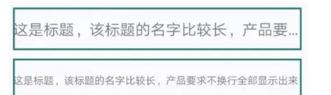
android:text="这是标题,该标题的名字比较长,产品要求不换行全部显示出来"
android:textSize="18sp"
android:autoSizeTextType="uniform"
android:autoSizeMaxTextSize="18sp"
android:autoSizeMinTextSize="10sp"
android:autoSizeStepGranularity="1sp"/>
属性解释:
- autoSizeTextType:设置 TextView 是否支持自动改变文本大小,none 表示不支持,uniform 表示支持。
- autoSizeMinTextSize:最小文字大小,例如设置为 10sp,表示文字最多只能缩小到 10sp。
- autoSizeMaxTextSize:最大文字大小,例如设置为 18sp,表示文字最多只能放大到 18sp。
- autoSizeStepGranularity:缩放粒度,即每次文字大小变化的数值,例如设置为 1sp,表示每次缩小或放大的值为 1sp。
代码中使用:
TextView tvText = findViewById(R.id.tv_text);
TextViewCompat.setAutoSizeTextTypeWithDefaults(tvText,TextViewCompat.AUTO_SIZE_TEXT_TYPE_UNIFORM);
TextViewCompat.setAutoSizeTextTypeUniformWithConfiguration(tvText,10,18,1, TypedValue.COMPLEX_UNIT_SP);

Autosizing 不生效?
Autosizing 在不同的宽高 wrap_content,是否多行,都生效,前提是已经摆放不下了
原因:设置了 android:singleLine="true"
解决: 去掉即可
自定义 View 的方式(固定宽度)
其核心思想和上面的 Autosizing 的方式类似,一般是测量 TextView 字体所占的宽度与 TextView 控件的宽度对比,动态改变 TextView 的字体大小。
类似:AutoSizeTextView
使用工具类自行计算(非控件固定宽度)
自定义 View 计算宽度的方法抽取出来:
- 基于当前 textSize 来获取宽度
- 如果获取的宽度小于等于可用的宽度,就设置该文字大小,否则一直循环重复 1~2 步骤
private void adjustTvTextSize(TextView tv, int maxWidth, String text) {
    int avaiWidth = maxWidth - tv.getPaddingLeft() - tv.getPaddingRight();
    if (avaiWidth <= 0) {
        return;
    }
    TextPaint textPaintClone = new TextPaint(tv.getPaint());
    float trySize = textPaintClone.getTextSize();
    while (textPaintClone.measureText(text) > avaiWidth) {
        trySize--;
        textPaintClone.setTextSize(trySize);
    }
    tv.setTextSize(TypedValue.COMPLEX_UNIT_PX, trySize);
}
示例:
<LinearLayout
  android:layout_width="match_parent"
  android:layout_height="wrap_content"
  android:layout_marginLeft="@dimen/d_15dp"
  android:layout_marginRight="@dimen/d_15dp"
  android:gravity="center"
  android:orientation="horizontal">
  <TextView
    android:id="@+id/tv_job_detail_dollar"
    android:layout_width="wrap_content"
    android:layout_height="wrap_content"
    android:text="$"
    android:textColor="@color/black"
    android:textSize="@dimen/job_detail_message_size"/>
  <TextView
    android:id="@+id/text_view_hourly_rate"
    android:layout_width="wrap_content"
    android:layout_height="wrap_content"
    android:layout_marginLeft="@dimen/d_2dp"
    android:singleLine="true"
    android:text="-"
    android:textColor="@color/job_detail_black"
    android:textSize="30sp" />
</LinearLayout>
可以看到 2 个都是 wrap content,那么如何实现这种适应宽度 + 多布局的变长宽度效果呢。其实就是需要我们调用方法手动的计算金额 TextView 的宽度
int mFullNameTVMaxWidth = CommUtils.dip2px(60);

//    mTextViewHourlyRate.setText(totalMoney);
//     while (true) {
//         float measureTextWidth = mTextViewHourlyRate.getPaint().measureText(totalMoney);

//         if (measureTextWidth > mFullNameTVMaxWidth) {
//             int textSize = (int) mTextViewHourlyRate.getTextSize();
//             textSize = textSize - 2;
//             mTextViewHourlyRate.setTextSize(TypedValue.COMPLEX_UNIT_PX, textSize);
//         } else {
//             break;
//         }
//     }
adjustTvTextSize(mTextViewHourlyRate,mFullNameTVMaxWidth,totalMoney)
效果:
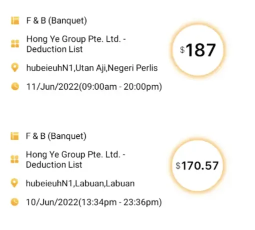
1 行展示不下,先缩放字体到最小大小 10sp,还展示不下,设置展示 2 行
val textPaintClone = TextPaint()

private fun adjustTvTextSize(
    tv: TextView,
    maxLineWidth: Int,
    text: String,
    defaultTextSizeSp: Float = 18F,
    minTextSizeSp: Float = 10F
) {
    val textSizeQueue: ArrayDeque<Float> by lazy {
        ArrayDeque<Float>().apply {
            add(18f)
            add(16f)
            add(14f)
            add(12f)
            add(10f)
        }
    }
    val availWidth = maxLineWidth - tv.paddingStart - tv.paddingEnd - 6F.dp()
    if (availWidth <= 0) {
        return
    }
    tv.maxLines = 1
    tv.textSize = defaultTextSizeSp

    textPaintClone.set(tv.paint)
    textPaintClone.textSize = ScreenUtils.sp2px(this, defaultTextSizeSp).toFloat()
    var tryTextSizeSp = defaultTextSizeSp
    Log.v(
        "hacket",
        "start tryTextSizeSp(sp)=${tryTextSizeSp}, defaultTextSizeSp=$defaultTextSizeSp, minTextSizeSp=$minTextSizeSp, textSizeQueue=$textSizeQueue"
    )
    var i = 1

    while (textSizeQueue.isNotEmpty() && textPaintClone.measureText(text) >= availWidth) {
        val tempTextSize = textSizeQueue.removeFirstOrNull() ?: 0F
        if (tempTextSize <= 0F) {
            continue
        }
        if (tryTextSizeSp <= minTextSizeSp) {
            continue
        }
        textPaintClone.textSize = ScreenUtils.sp2px(this, tempTextSize).toFloat()
        tv.textSize = tempTextSize
//            val isAvail = textPaintClone.measureText(text) > availWidth
//            if (!isAvail) {
//                continue
//            }
        tryTextSizeSp = tempTextSize

        Log.v(
            "hacket", "第${i}次 尝试,measureText=${
                textPaintClone.measureText(
                    text
                )
            }, availWidth=$availWidth, tryTextSizeSp=$tryTextSizeSp(${
                ScreenUtils.sp2px(
                    this, tryTextSizeSp
                ).toFloat()
            }), minTextSizeSp=$minTextSizeSp, textSizeQueue=$textSizeQueue"
        )
        i++
    }
    val avail = textPaintClone.measureText(text) > availWidth
    if (avail) {
        tv.maxLines = 2
    }
    Log.w("hacket", "final tryTextSizeSp=${tryTextSizeSp}, avail=$avail")
}
xml:
<androidx.appcompat.widget.AppCompatTextView
    android:id="@+id/tvCouponVal"
    android:layout_width="0dp"
    android:layout_height="wrap_content"
    android:ellipsize="end"
    android:gravity="center"
    android:maxLines="1"
    android:paddingHorizontal="27dp"
    android:text="MIỄN PHÍ VẬN CHUYỂN"
    android:textColor="@color/sui_color_discount"
    android:textFontWeight="700"
    android:textSize="@dimen/sui_text_size_18"
    android:textStyle="bold"
    app:layout_constrainedWidth="true"
    app:layout_constraintBottom_toBottomOf="parent"
    app:layout_constraintEnd_toEndOf="@id/ivCouponIcon"
    app:layout_constraintStart_toStartOf="@id/ivCouponIcon"
    app:layout_constraintTop_toTopOf="parent"
    app:layout_constraintVertical_bias="0.15" />
TextView 跑马灯(显示一行,滚动显示)
TextView 不会主动获取焦点,一个布局中只能有一个组件获取焦点
获取到焦点时跑马灯。
设置成 maxLines="1" 时跑马灯不工作,要用 singleLine="true"
系统自带的 xml 中进行属性配置
android:ellipsize="marquee"
android:focusable="true"
android:focusableInTouchMode="true"
android:singleLine="true"  //只显示一行
自定义一个滚动的 TextView
对 button,这种,可以触摸获取焦点的,配置 android:ellipsize="marquee" android:singleLine="true" ,就可以将看不到的文字显示出来,而 TextView,天生不能获取焦点,那只能重写里面的方法,isActivated(),让其返回 true,那么就可以被获取焦点了。
public class FocusedTextView extends AppCompatTextView {
    public FocusedTextView(Context context, AttributeSet attrs, int defStyle) {
        super(context, attrs, defStyle);
    }

    public FocusedTextView(Context context, AttributeSet attrs) {
        super(context, attrs);
    }

    public FocusedTextView(Context context) {
        super(context);
    }

    @Override
    public boolean isFocused() {
        return true;
    }
}
控制跑马灯
btn_start_marquee.setOnClickListener {
    if (tv_marquee.getEllipsize() != null) {
        tv_marquee.setEllipsize(null);
    } else {
        tv_marquee.setEllipsize(TextUtils.TruncateAt.MARQUEE);
    }
}
跑马灯控制方向
安卓字体不随系统字体变化
1. 字体单位用 dp 而不是 sp
2. 手动设置 setTextSize 不受影响
但如果没有设置用的系统默认字体,无效,TextView 读取属性设置字体不是走的这个方法,而是走的 setRawTextSize
@Override
public void setTextSize(int unit, float size) {
    if (unit == TypedValue.COMPLEX_UNIT_SP) {
        int dpUnit = TypedValue.COMPLEX_UNIT_DIP;
        super.setTextSize(dpUnit, size);
    }
}
3. Configuration 不受影响
https://www.jianshu.com/p/059f3bad61b2
TextView 基线
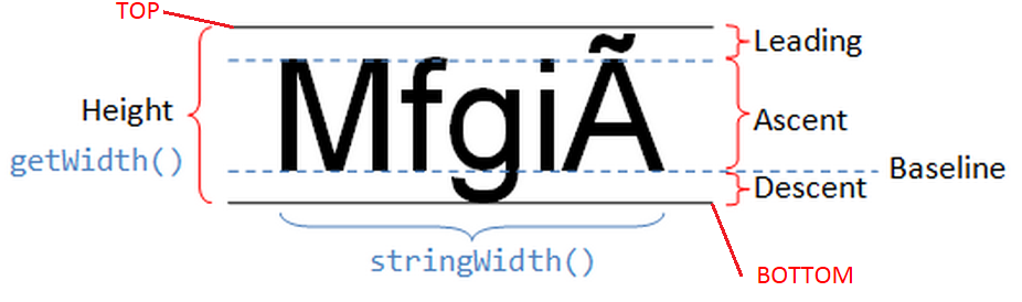
基线辅助测试
https://github.com/suragch/AndroidFontMetrics
TextView 中的文字长度测量
TextView.getPaint().measureText(String text)
只是测试传入的 text 在该 TextView 的配置下的总长度,并不是计算每一行的长度。
TextView.getLayout().getLineWidth(int line)
这个方法确实计算得到的是每一行文字的实际长度,注意这里是实际长度,也就是说当设置 singleLine 属性时,用这个方法测量得到的是一整行文字的长度,包括溢出部分。
设置 android:maxLines="1" 和 android:singleLine="true" 有什么区别
- maxLines 还是会默认自动进行换行策略,假如一段文字自动换行后有 5 行,maxLines 设置为 1,那么就只显示第一行的内容,其他行不显示。
- singleLine, 那么这段可以有 5 行的文字将会被强制放在 1 行里,然后看最多能显示多少字符,剩下的不显示。
设置成 maxLines="1" 时跑马灯不工作
TextView 添加超链接 (两种实现方式)
方法一:Linkify- 设置 autolink,让系统自动识别超链接
tv.setAutoLinkMask(Linkify.ALL);
tv.setLinksClickable(true);//设置链接可点击,不设置链接不会变蓝
tv.setMovementMethod(LinkMovementMethod.getInstance());
方式二:通过 HTML 格式化你的网址
String html = "<a href='http://www.baidu.com'>百度一下</a>";//注意这里必须加上协议号,即http://。
CharSequence charSequence = Html.fromHtml(html);
tv.setText(charSequence);
tv.setMovementMethod(LinkMovementMethod.getInstance());
小结
总结一下就是,以 html 显示超链接,必须写全 url。以 setAutoLinkMask(Linkify.ALL) 可以不用不用写全,就能自动识别出来。
这两种方法,都得设置一下 setMovementMethod,才会跳转。
另外 setAutoLinkMask 不仅 识别超链接,包括电话号码之类的。
MovementMethod
ScrollingMovementMethod
实现带滚动条的 TextView,在更新文字时自动滚动到最后一行
textView = (TextView) findViewById( R.id.tv ) ;
textView.setMovementMethod(ScrollingMovementMethod.getInstance());
TextView 中的各种 padding
padding 相关 API
- getWidth(), getHeight()
对应你代码里的layout_width和layout_height。 - getPaddingLeft/Right/Top/Bottom()
对应代码里的 Padding,布局里的android:padding。 - getCompoundDrawablePadding()
TextView 设置的 drawawble 和文字之间的 padding 对应布局里的android:drawablePadding。 - getCompoundPaddingLeft/Right/Top/Bottom()
获取混合的 Padding, 既然是混合的,那么它的值也就是 padding + 图片的大小 + drawablePadding 的值(getCompoundPaddingLeft() = getPaddingLeft() + drawable.getIntrinsicWidth() + getCompoundDrawablePadding())。说得通俗点就是,它是获取文字区域到 TextView 边界之间的间隔。 drawable 和 text 之间的 padding,就是 drawablePadding - getExtendedPaddingTop()/Bottom
当有部分文字没有显示出来时,也就是设置了 maxLine 时,它的值就等于首行文字到 TextView 顶端的距离。同理,getExtendedPaddingBottom() 就是最后一行文字到 TextVeiw 底部距离。其他情况下,他的值等于 getCompoundPaddingTop/Bottom() 的值。 - getTotalPaddingLeft/Right/Top/Bottom()
获取总的 Padding 值,看了下源码,左右的值直接就是等于 compoundPadding 的值,上下的值等于 ExtendedPadding 的值再加上 offset 的值(跟 Gravity 的垂直方向的布局有关。说得通俗点就是,不管有没有 maxLines,上下的值都分别等于首行到 TextView 顶端和末行到 TextView 底部的值。
getTotalPaddingRight() = getCompoundDrawablePadding() + getCompoundDrawables()[2].getBounds().width()
- getPaddingRight() 所有的 padding
- setPadding setPaddingRelative Android4.0(API 17)之后添加了设置 Layout 方向的功能(setLayoutDirection(@LayoutDir int layoutDirection),从左到右或从右到左),setPadding 的话不管方向如何都按照左上右下的顺序来配置 Padding,setPaddingRelative 的话则会按照配置的 LayoutDirection 来进行设置(从左到右的话为左上右下,从右到左的话为右上左下的顺序)
- setIncludeFontPadding 设置文本是否包含顶部和底部额外空白,给音标用的
去掉 TextView 上下为音标预留的一些 padding 值
setIncludeFontPadding(false)
setCompoundDrawablePadding(drawablePadding); 不影响 padding 的值
EditText 默认 padding
EditText 没有默认的 padding,如果有 padding,那么都是来自背景图 (.9 的图)。
需要在 xml 中配置,:
android:background="@null"
如果用代码写,padding 还是存在:
CompatUtil.setBackground(this, null);
如果是 EditText 的话,如果高度太低,那么会出现 EditText 的文本可以上下滚动
动态改变 Background 后 Padding 无效的问题
在 Layout 中指定好 background 和 padding 以后,程序里面动态修改 background 之后 padding 就失效了,貌似是一个 BUG。
解决:在 setBackgroundResource 之后重新设置一下 padding。
// 方法一
int bottom = theView.getPaddingBottom();
int top = theView.getPaddingTop();
int right = theView.getPaddingRight();
int left = theView.getPaddingLeft();
theView.setBackgroundResource(R.drawable.entry_bg_with_image);
theView.setPadding(left, top, right, bottom);

// 方法二
int pad = resources.getDimensionPixelSize(R.dimen.linear_layout_padding);
theView.setBackgroundResource(R.drawable.entry_bg_with_image);
theView.setPadding(pad, pad, pad, pad);